Modern Alternatives to Pop-Up Windows for Use on CloudPages

I recently stumbled upon Jörn Berkefeld‘s comment under a LinkedIn post describing how to add a pop-up window to a CloudPage. Jörn wrote:


Main issue with approach is that 9 times out 10 the user’s browser will block that these days. There was a time when code like yours was used to open hundreds of spam windows to mess with users. That’s why overlays are mostly used now which live in the same tab/window as the original page.

I couldn’t agree more, so if you want to implement solutions for your clients that are more from this century than the previous one, here are a few examples of overlays that you can easily use on a Salesforce Marketing Cloud CloudPage.

What are overlays?

The term “overlay” means that the additional content you are displaying for your users is displayed “on top” of the existing content. The overlays can either block the content underneath until the user interacts with the overlay, or allow interaction with both the overlay and the underlying content at the same time.
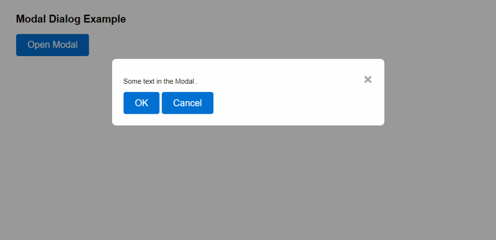
Modal Dialogs

A modal dialog is a window that appears on top of the main content, requiring user to do something before they can return to the main content. They often dim the background to focus attention on the dialog. They are commonly used for alerts, confirmations, forms, and notifications that require response from the user.

Here’s the code used to create the above modal dialog window:

<!DOCTYPE html>
<html lang="en">
<head>
<meta charset="UTF-8">
<meta name="viewport" content="width=device-width, initial-scale=1.0">
<style>
body { font-family: Arial, sans-serif; }
.modal { display: none; position: fixed; z-index: 1; left: 0; top: 0; width: 100%; height: 100%; overflow: auto; background-color: rgba(0,0,0,0.4); padding-top: 60px; }
.modal-content { background-color: #fefefe; margin: 5% auto; padding: 20px; border: 1px solid #888; width: 80%; border-radius: 8px; }
.close { color: #aaa; float: right; font-size: 28px; font-weight: bold; }
.close:hover, .close:focus { color: black; text-decoration: none; cursor: pointer; }
.button { background-color: #0070d2; color: white; padding: 10px 20px; border: none; border-radius: 4px; cursor: pointer; font-size: 16px; }
.button:hover { background-color: #005fb2; }
</style>
</head>
<body>
<h2>Modal Dialog Example</h2>
<button id="myBtn" class="button">Open Modal</button>
<div id="myModal" class="modal">
<div class="modal-content">
<span class="close">&times;</span>
<p>Some text in the Modal..</p>
<button class="button">OK</button>
<button class="button">Cancel</button>
</div>
</div>
<script>
var modal = document.getElementById("myModal");
var btn = document.getElementById("myBtn");
var span = document.getElementsByClassName("close")[0];
btn.onclick = function() {
modal.style.display = "block";
}
span.onclick = function() {
modal.style.display = "none";
}
window.onclick = function(event) {
if (event.target == modal) {
modal.style.display = "none";
}
}
</script>
</body>
</html>

Sline-In Panels

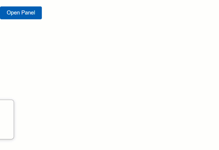
A slide-in panel is a window that slides into the page from the side of the screen. It only overlays part of the main content, allowing the user to interact with both the overlay and the main content at the same time. It’s used for any optional, additional content that you want to display for the user.

Here’s the code used to create the above slide-in panel:

<!DOCTYPE html>
<html lang="en">
<head>
<meta charset="UTF-8">
<meta name="viewport" content="width=device-width, initial-scale=1.0">
<style>
body { font-family: Arial, sans-serif; justify-content: center; align-items: center; height: 100vh; margin: 0; }
.slide-in-panel { position: fixed; left: -300px; top: 50%; transform: translateY(-50%); width: 300px; background: #fff; box-shadow: 0 2px 10px rgba(0,0,0,0.2); transition: left 0.3s ease; padding: 20px; border-radius: 8px; border: 1px solid #888; }
.slide-in-panel.open { left: 0; }
.slide-in-panel p { margin: 0 0 20px; font-size: 16px; }
.button, .trigger { background-color: #0070d2; color: white; padding: 10px 20px; border: none; border-radius: 4px; cursor: pointer; font-size: 16px; transition: background-color 0.3s ease; }
.button:hover, .trigger:hover { background-color: #005fb2; }
</style>
</head>
<body>
<button class="trigger">Open Panel</button>
<div class="slide-in-panel" id="slideInPanel">
<p>Do you want to proceed?</p>
<button class="button" onclick="handleResponse('yes')">Yes</button>
<button class="button" onclick="handleResponse('no')">No</button>
</div>
<script>
document.querySelector('.trigger').addEventListener('click', function() {
document.getElementById('slideInPanel').classList.toggle('open');
});
function handleResponse(response) {
alert('You selected: ' + response);
document.getElementById('slideInPanel').classList.remove('open');
}
</script>
</body>
</html>

Toast Notifications

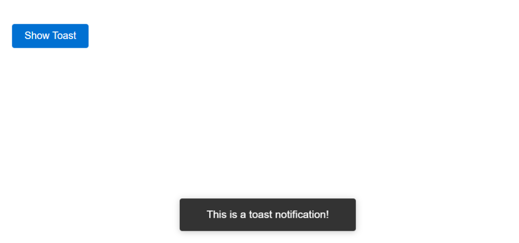
A toast notification is a small window that appears in a non-intrusive way and provides feedback or information to the user, without blocking the user’s ability to interact with the rest of the page. It’s typically used for brief messages like status updates, form submissions, or reminders.

Here’s the code used to create the above toast notification:

<!DOCTYPE html>
<html lang="en">
<head>
<meta charset="UTF-8">
<meta name="viewport" content="width=device-width, initial-scale=1.0">
<style>
body { font-family: Arial, sans-serif; }
.styled-button { display: inline-block; padding: 10px 20px; font-size: 16px; color: #fff; background-color: #0070d2; border: none; border-radius: 4px; cursor: pointer; transition: background-color 0.3s ease; }
.styled-button:hover { background-color: #005fb2; }
.toast { visibility: hidden; min-width: 250px; margin-left: -125px; background-color: #333; color: #fff; text-align: center; border-radius: 4px; padding: 16px; position: fixed; z-index: 1; left: 50%; bottom: 30px; font-size: 17px; box-shadow: 0 2px 10px rgba(0, 0, 0, 0.2); }
.toast.show { visibility: visible; -webkit-animation: fadein 0.5s, fadeout 0.5s 2.5s; animation: fadein 0.5s, fadeout 0.5s 2.5s; }
@-webkit-keyframes fadein { from {bottom: 0; opacity: 0;} to {bottom: 30px; opacity: 1;} }
@keyframes fadein { from {bottom: 0; opacity: 0;} to {bottom: 30px; opacity: 1;} }
@-webkit-keyframes fadeout { from {bottom: 30px; opacity: 1;} to {bottom: 0; opacity: 0;} }
@keyframes fadeout { from {bottom: 30px; opacity: 1;} to {bottom: 0; opacity: 0;} }
</style>
</head>
<body>
<div class="slds-builder-toolbar__actions" aria-label="Document actions">
<button class="styled-button" onclick="showToast()">Show Toast</button>
</div>
<div id="toast" class="toast">This is a toast notification!</div>
<script>
function showToast() {
var toast = document.getElementById("toast");
toast.className = "toast show";
setTimeout(function() { toast.className = toast.className.replace("show", ""); }, 3000);
}
</script>
</body>
</html>

Questions? Comments?

Leave a comment below or email me at zuzanna@sfmarketing.cloud.


Leave a comment